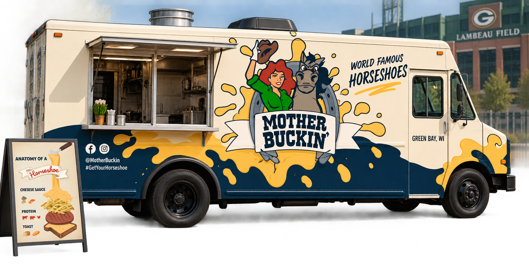
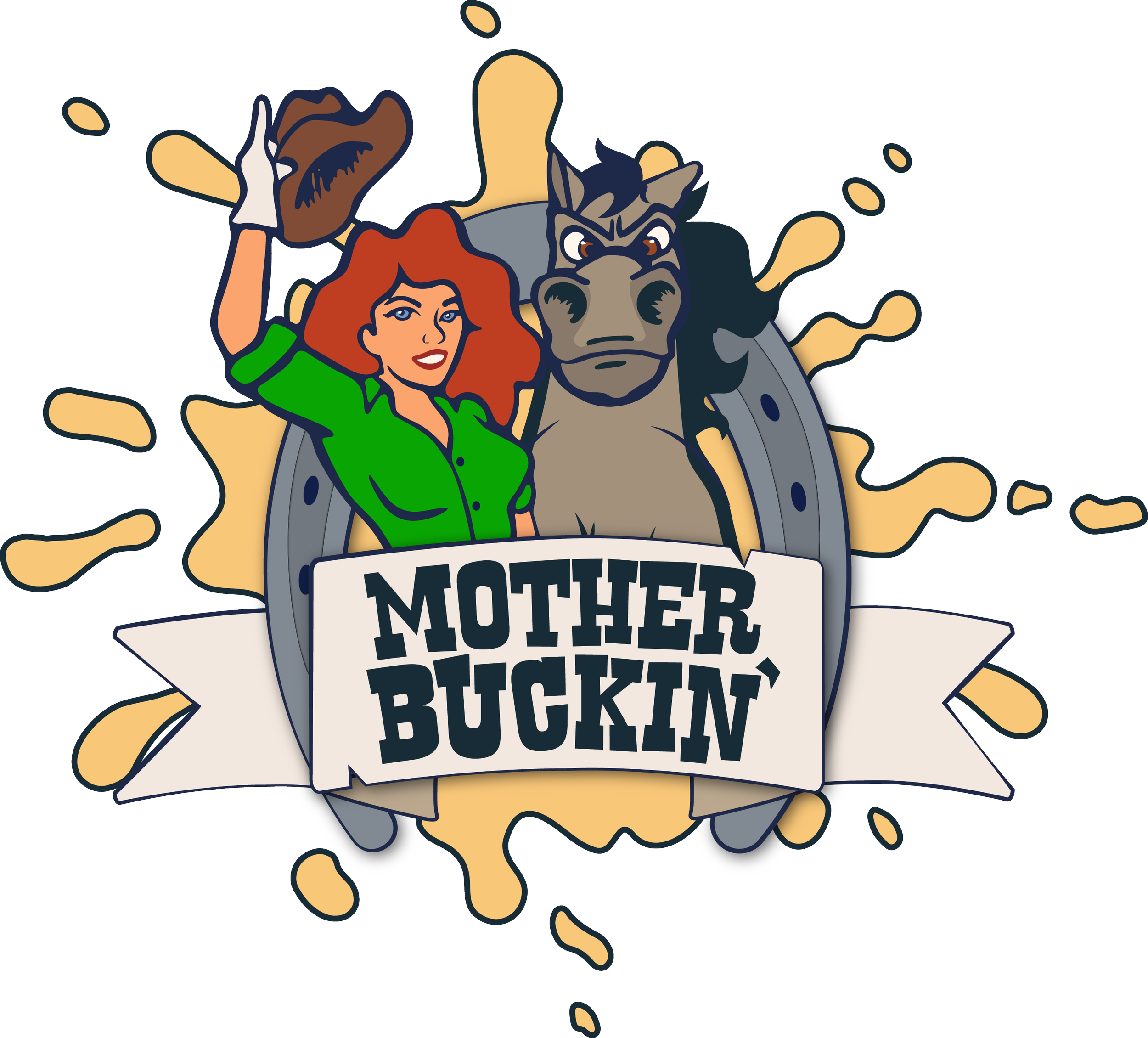
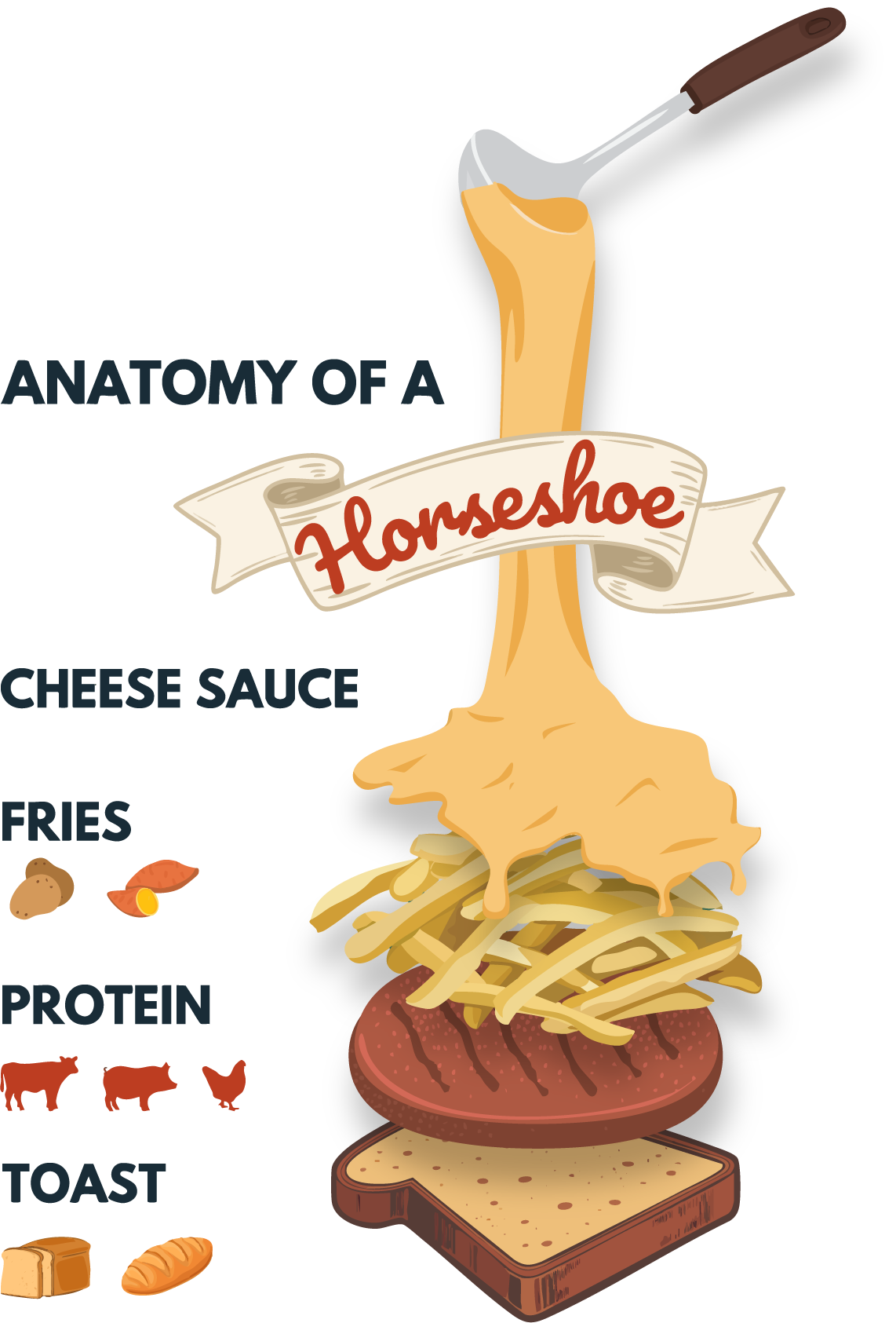
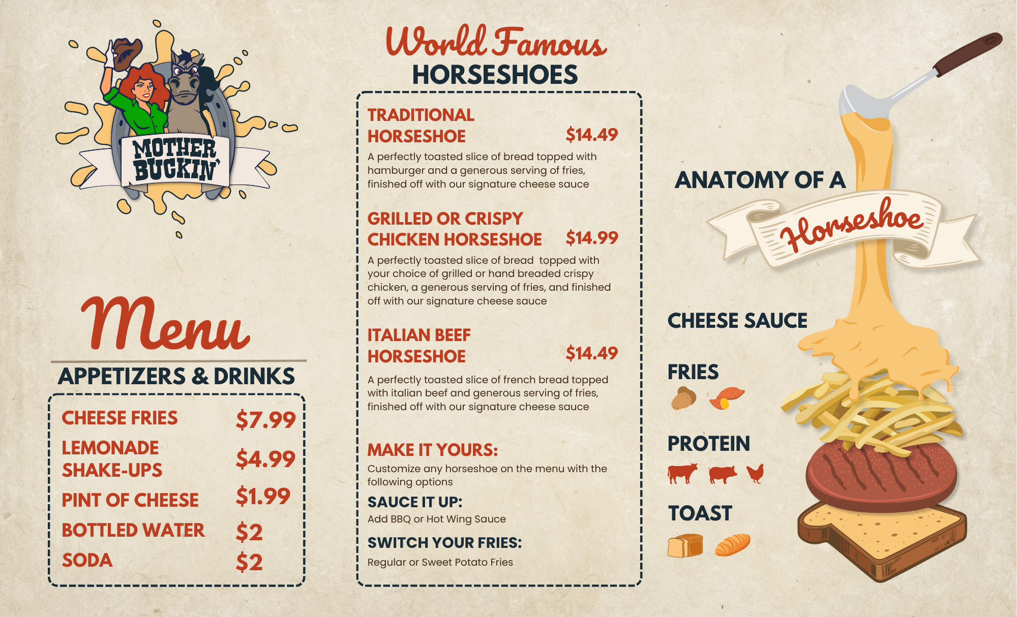
Mother Buckin’ is a Green Bay–based food truck bringing the Midwest classic horseshoe sandwich to Wisconsin. The brand identity was designed to feel bold, memorable and full of personality, pairing a mascot-style logo with a slightly rebellious Western attitude. The illustrated cowgirl and horse give the brand an approachable, character-driven presence, while the warm cream, red, navy and cheese-inspired gold palette reinforces the comfort-food experience. That visual language carries through the menu and social media graphics, using vintage typography, playful illustrations and educational elements like the “Anatomy of a Horseshoe” to introduce an unfamiliar regional dish in a way that feels fun and accessible. Together, the pieces create a cohesive identity that feels distinctly Midwestern, energetic and unmistakably Mother Buckin’.